Two Ideas for Montana
I read someplace recently that citizens of Montana and Idaho were the two groups of people least likely to fly their state flags. I can't say as I blame them, for they both, like Oregonians, have to live with prime examples of American Seals-on-Bedsheets (or SOB) flags. Here's Montana's (image, again, by the talented Mario Fabretto from the FOTW Flags of the World web site):
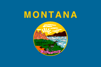
As in so many other cases, the Montana flag has a seal on a blue field, here livened up by the state's name in its official, state-specified, Helvetica Bold font. Note, too, how many different colors there are in the seal. No wonder nobody wants to fly this: it would bankrupt them to have to manufacture the flag.
Here is my first, highly unsolicited, alternative proposal:
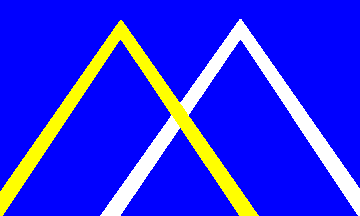
I'm sure you can identify much of the symbolism here. The brighter blue represents Montana's well-known nickname, The Big Sky Country. The two lines suggest mountains (Montana's name, of course, is a kind of Latin/Spanish word for mountain), while the colors recall the state motto — printed on the banner at the bottom of the state seal — oro y plata, which translates to "gold and silver." The two mountains together form the letter M.
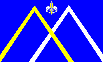
It occurred to me that the design could possibly use a little something extra. So for my alternative suggestion, I added the fleur-de-lis from the state's military crest (used by its National Guard units):