An Idea for Oregon
If you've read my discussion of the problem with most American state flags, you'll agree that Oregon's offers a great opportunity for something better. Here is the front of Oregon's flag (image by Mario Fabretto from the FOTW Flags of the World web site):
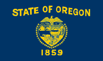
Words (and lots of them), and a dense and complex seal design. But that's not all. You'll notice I specified that this is the front of Oregon's flag. That's because Oregon is the only state that has a different design for the back of their flag: a golden beaver.
Here is my alternative proposal:
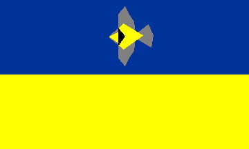
Blue and gold are Oregon's official colors, and are taken from the current flag, though I have used a darker blue and a brighter gold. The bird is a stylized depiction of Oregon's state bird, the western meadowlark.
For additional symbolism, the bird also represents Oregon's official motto, Alis Volat Propiis, which translates to "She Flies With Her Own Wings."
The Kindness of Strangers!
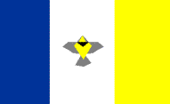
Brian Truncale, a visitor to my page, very generously giffed several versions of my design that were infinitely less lame than the one I had up here. In fact, they look pretty darn good. The one above is his straightforward rendering of my design. He also had two slight modifications of that design. Note that on the flag on the right, the shade of blue is that on the current flag (instead of the darker blue I called out), and the meadowlark is flying to the northwest, symbolic of Oregon's geographical position.
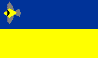
Brian also created two variations on my original theme:
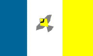
Thanks, Brian. I appreciate your help!
